Grid - Admin Dashboard
Assignment Overview
You will use CSS Grid to create a responsive admin dashboard layout. This assignment focuses on grid-based layouts, intrinsic responsive design using auto-fit and minmax(), and controlling grid item placement.
Learning Objectives
Apply CSS Grid to create complex, multi-area layouts
Use responsive grid techniques without media queries
Control grid item spanning across columns and rows
Understand the relationship between parent and child grids
Starting Code
HTML Code
<!DOCTYPE html>
<html lang="en">
<head>
<meta charset="UTF-8">
<meta name="viewport" content="width=device-width, initial-scale=1.0">
<title>Document</title>
<link rel="stylesheet" href="styles.css">
</head>
<body>
<section class="header">
<h1>Admin Dashboard</h1>
</section>
<section class="container">
<aside class="sidebar">
<nav>
<ul>
<li><a href="#">Home</a></li>
<li><a href="#">Reports</a></li>
<li><a href="#">Settings</a></li>
<li><a href="#">Logout</a></li>
</ul>
</nav>
</aside>
<main class="content">
<div class="widget">Widget 1</div>
<div class="widget">Widget 2</div>
<div class="widget">Widget 3</div>
<div class="widget">Widget 4</div>
<div class="widget">Widget 5</div>
<div class="widget">Widget 6</div>
</main>
</section>
<footer class="footer">
<p>© 2025 Dashboard Co.</p>
</footer>
</body>Starting CSS
/* General Styling for Admin Dashboard */
body {
font-family: Arial, sans-serif;
margin: 0;
padding: 0;
background-color: #f4f4f4;
color: #333;
}
.header, .footer {
background-color: #333;
color: white;
text-align: center;
padding: 10px;
}
.container {
/* HINT: What display property creates a grid layout? */
/* HINT: How many rows do you need? Consider header, content, and footer areas */
/* HINT: The sidebar should have a fixed width. What should the content area width be? */
/* HINT: Add spacing between grid items for visual separation */
height: 100vh;
}
.sidebar {
background-color: #555;
color: white;
padding: 20px;
border-radius: 8px;
}
.sidebar ul {
list-style: none;
padding: 0;
}
.sidebar ul li {
margin: 10px 0;
}
.sidebar ul li a {
color: white;
text-decoration: none;
}
.content {
/* HINT: The content area should also use grid to arrange the widgets */
/* HINT: How can you make columns automatically adjust to available space? */
/* HINT: What's the minimum width each widget should have? What's the maximum? */
/* HINT: Add spacing between widgets */
}
.widget {
background-color: white;
padding: 20px;
border-radius: 8px;
box-shadow: 0 2px 5px rgba(0, 0, 0, 0.1);
text-align: center;
}
Assignment Tasks
Task 1: Complete the Container Grid
The .container class needs to establish the main layout grid. You'll need to:
Set the display property to create a grid
Define the row structure (think about which elements need which rows)
Define the column structure (sidebar should be 250px wide, content should take remaining space)
Add gap spacing between grid areas (20px recommended)
Task 2: Complete the Content Grid
The .content class holds the widgets and needs its own grid. You'll need to:
Set the display property to create a grid
Use repeat() with auto-fit to create responsive columns
Use minmax() to set minimum widget width at 150px and maximum at equal distribution
Add gap spacing between widgets (15px recommended)
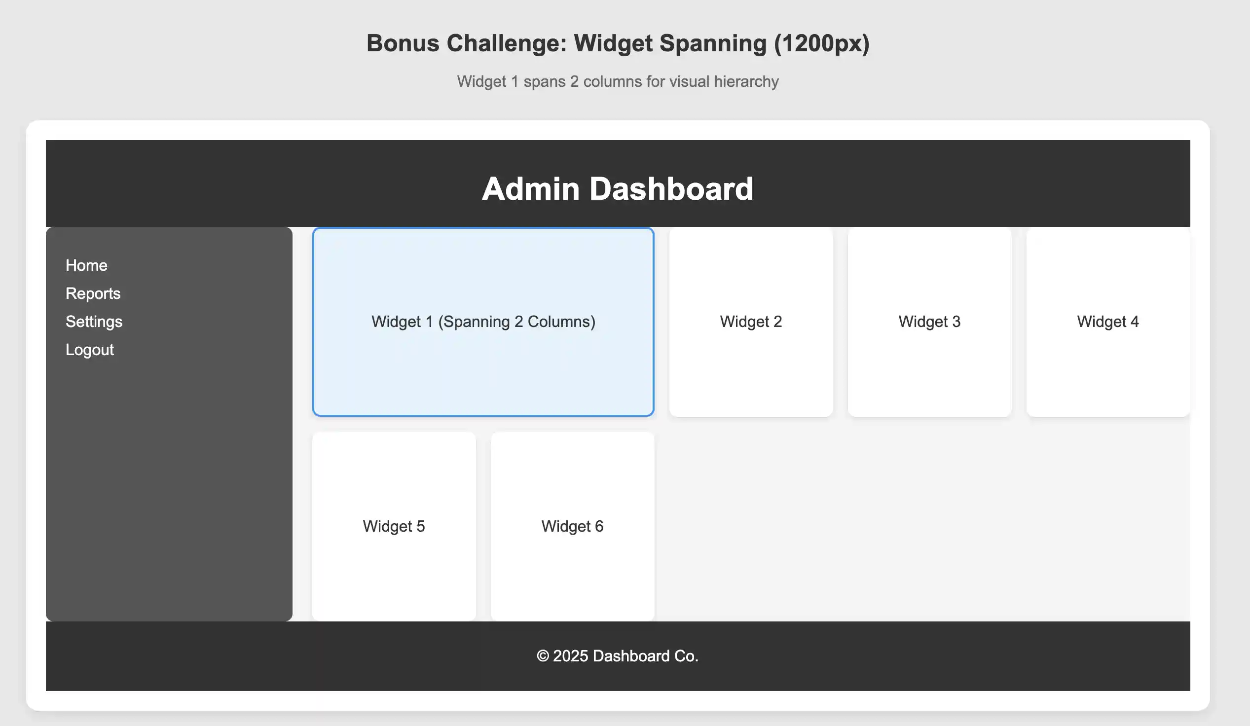
Task 3: Widget Spanning
Bonus Challenge: Make Widget 1 span across 2 columns to create visual hierarchy.
HINT: Think about how to specify start and end positions, or how many columns to span
Expected Behavior
Responsive Characteristics
See the mockups. below for visual examples
At wide widths: Widgets should arrange in multiple columns (3-4 widgets per row)
At medium widths: Widgets should adjust to 2-3 per row automatically
At narrow widths: Widgets should stack into 1-2 columns
The sidebar maintains its 250px width while content area flexes
No media queries needed - the grid adapts automatically!
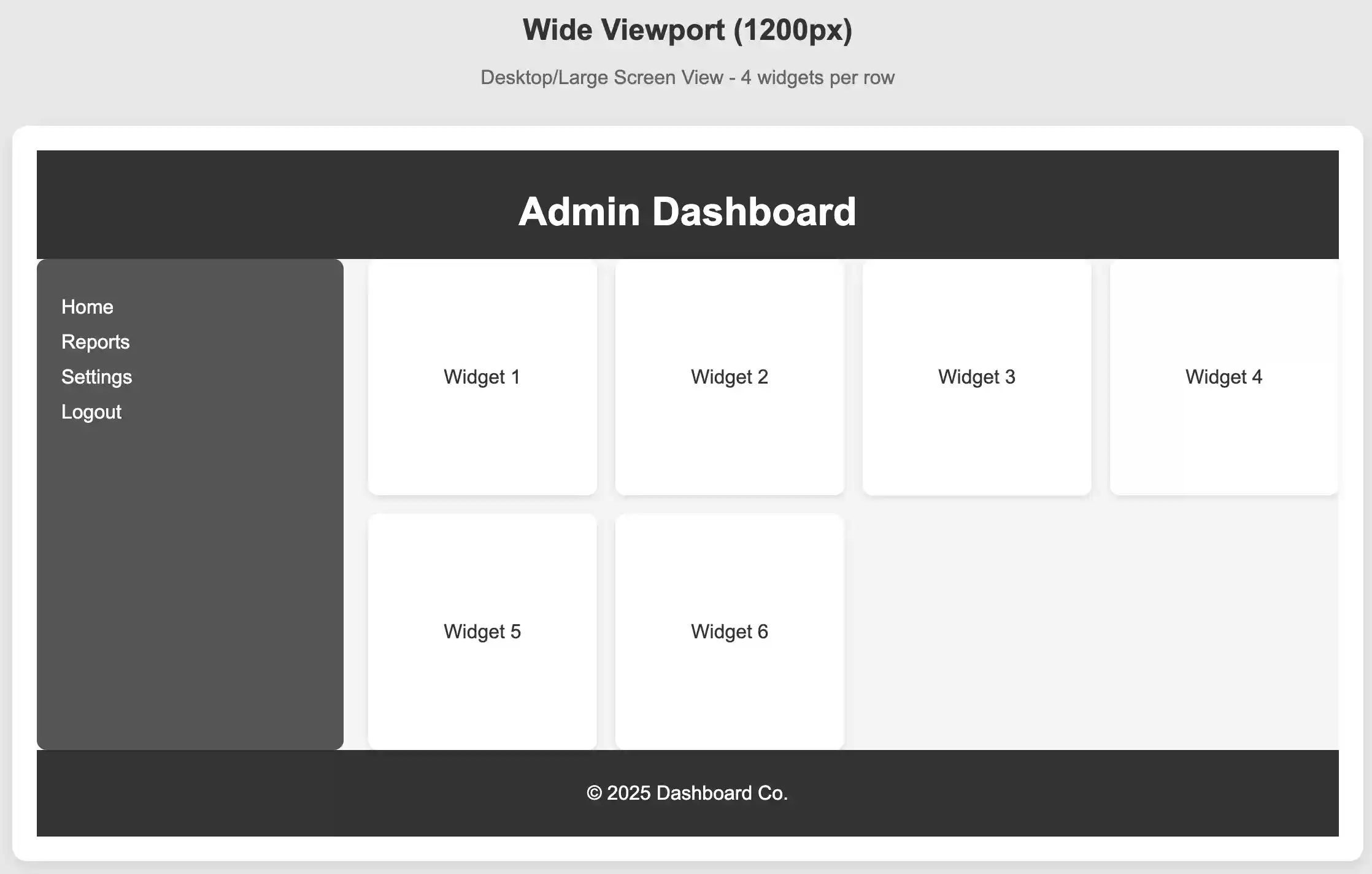
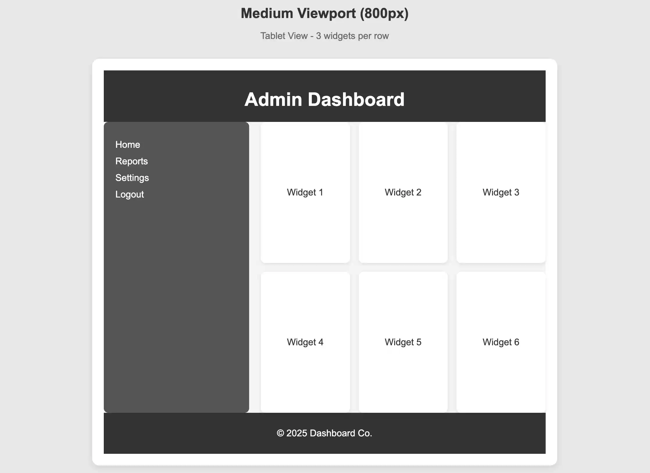
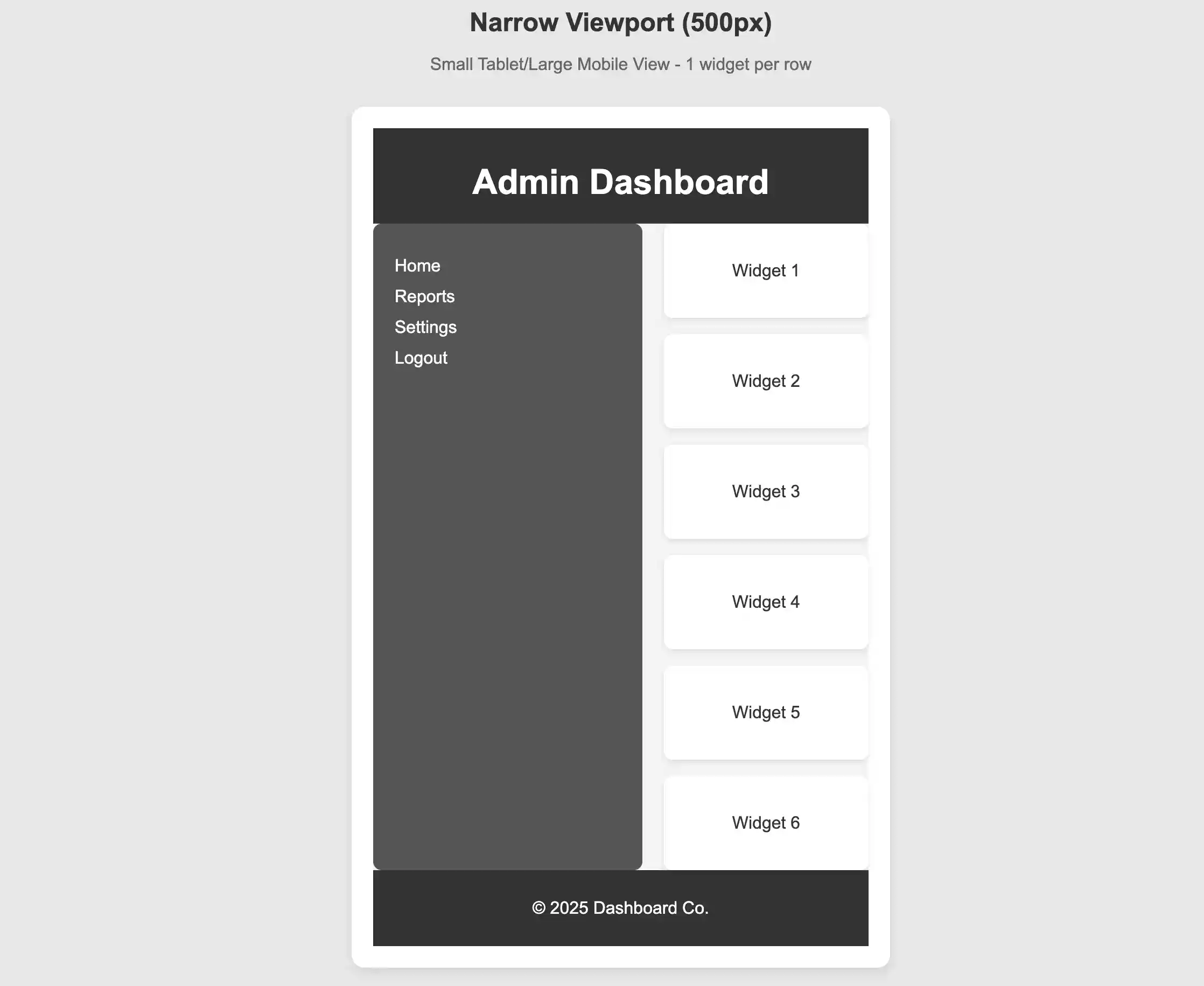
Visual Layout
Header spans full width at top
Sidebar on left (250px fixed width)
Content area on right (flexible width) with grid of widgets
Footer spans full width at bottom
Consistent spacing throughout
Evaluation Criteria
Container uses CSS Grid with proper row and column definitions
Content area uses nested grid for widgets
Widgets respond to viewport width changes
Proper use of auto-fit, minmax(), and repeat()
Appropriate gap spacing applied
(Bonus) Widget spanning implemented correctly
Resources to Review
CSS Grid display: grid
grid-template-rows and grid-template-columns
repeat() function
auto-fit keyword
minmax() function
gap property
grid-column property for spanning
Locked Message