Layout Review Exercise
Table of Contents
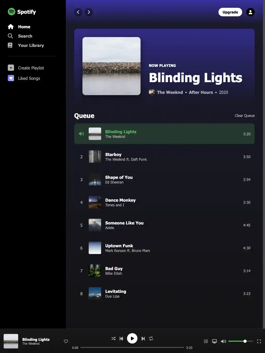
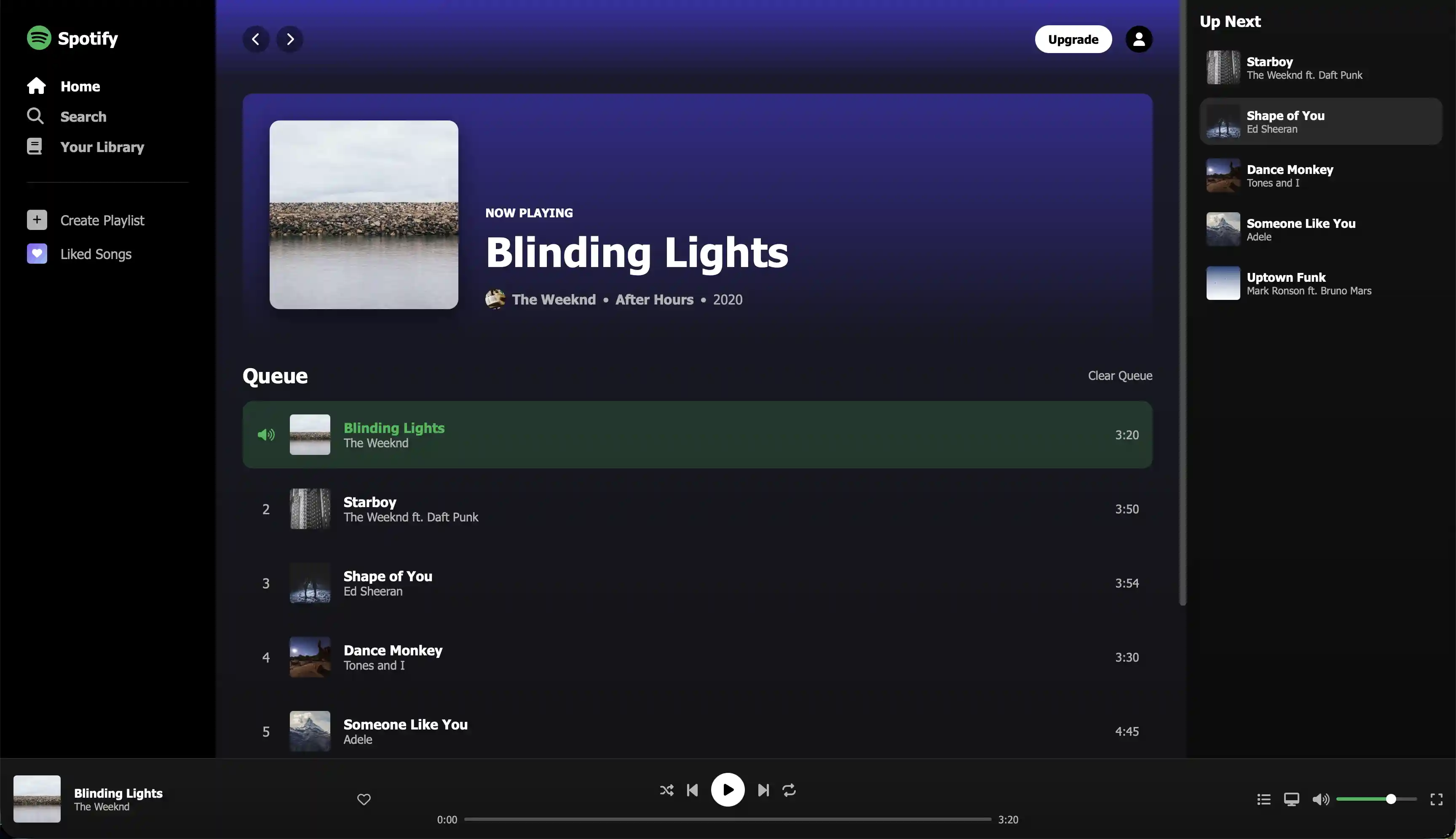
The Challenge
This is an assignment where are you tasked with deciding how to translate a design layout into code. You are provided with the HTML and some basic CSS. A high-res mockup is also included.
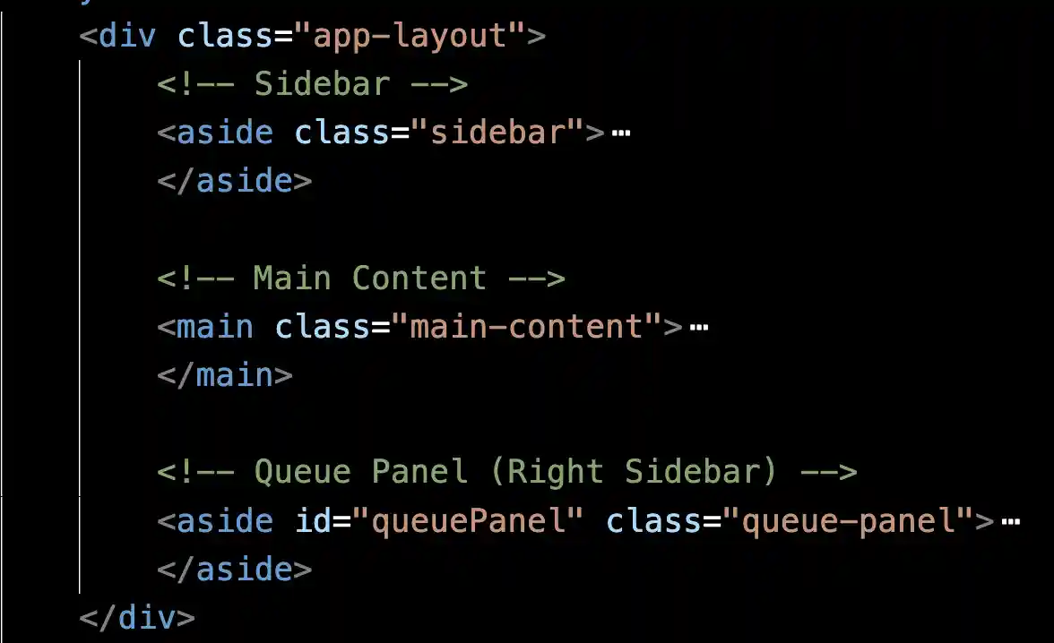
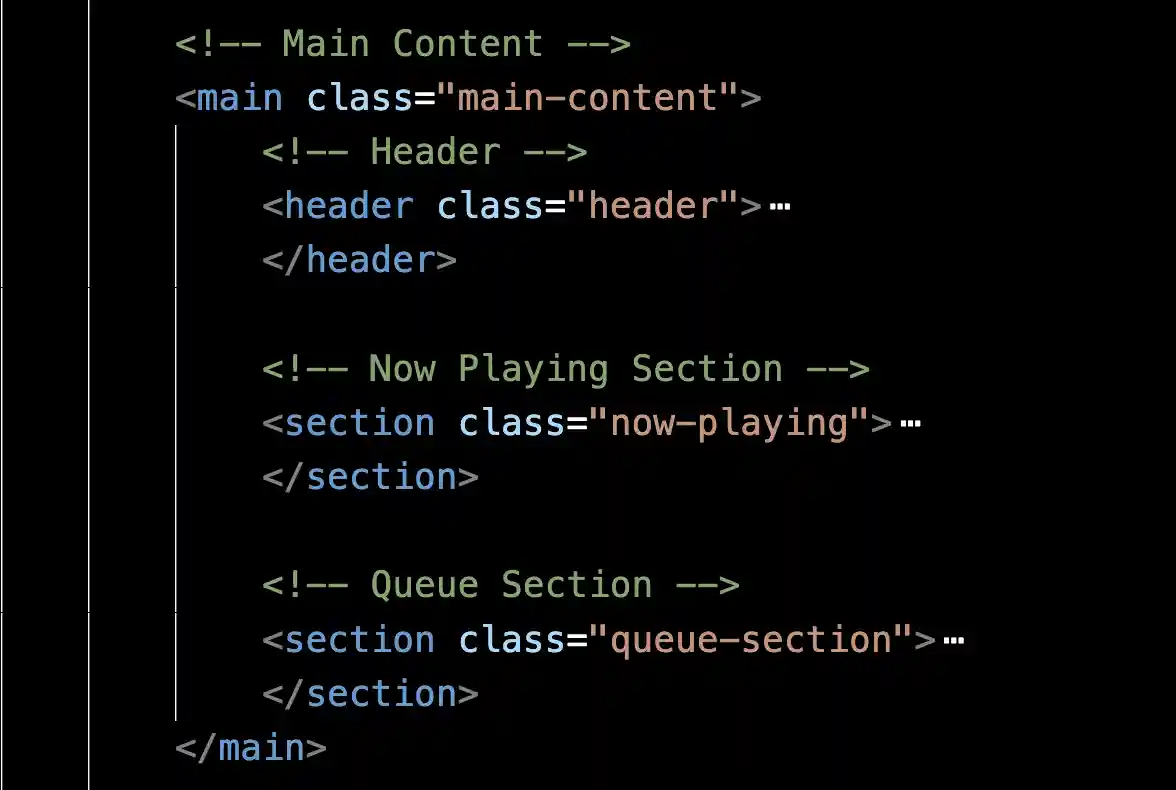
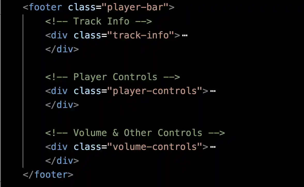
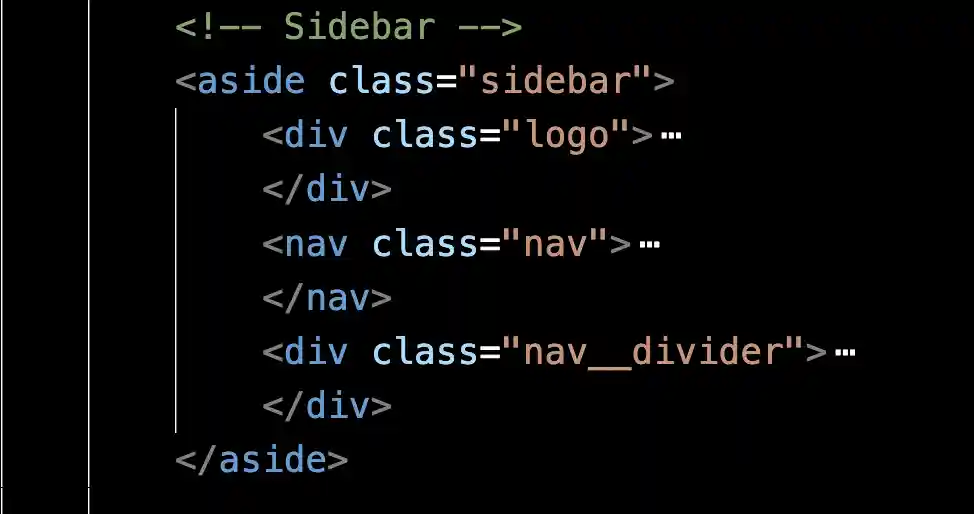
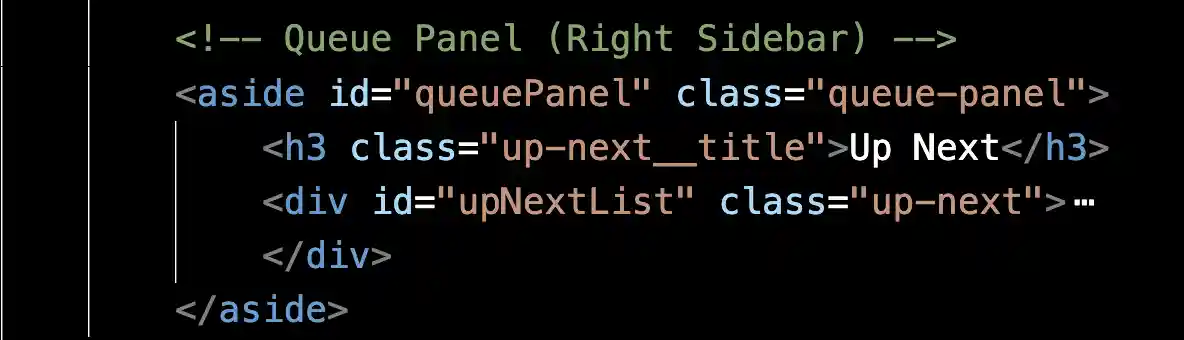
Parent-Child Relationships
The biggest thing you can do to understand the code and formulate an approach is to see the structure in the HTML. In particular, you want to look at parent-child relationships.
Below are some screenshots that these relationships.
Opportunities and Constraints
You ARE allowed to:
add non-semantic parent elements such as <div> to help group elements.
use grid, flex, or a combination of the 2 to achieve the layout. The most important thing is that you are reflecting on why you are doing what you are doing.
You ARE NOT allowed to:
change any HTML that is already there.
Starting Files
General Guidance
Use Flexbox When:
Items are arranged in a single row or column
You want items to automatically size based on content
You need to align items along one axis
Items should wrap to new lines
You want flexible spacing between items
Use Grid When:
You need precise control over rows AND columns
Layout is truly two-dimensional
You want named grid areas for clarity
Items need to align in both directions
You have a fixed number of columns/rows
Common Patterns You'll Need
css

/* Pattern 1: Horizontal Alignment With Space Between */

.example {
    display: flex;
    justify-content: space-between;
    align-items: center;
}

/* Pattern 2: Vertical stacking with gap */

.example {
    display: flex;
    flex-direction: column;
    gap: var(--spacing-md);
}

/* Pattern 3: Item that grows to fill space...to be used on the child element */

.example {
    flex-grow: 1;
}


/* Pattern 4: Centered content */

.example {
    display: flex;
    align-items: center;
    justify-content: center;
}


/* Pattern 5: Three-column layout */
.example {
    display: grid;
    grid-template-columns: auto 1fr auto;
}
Additional Tips
Your objective is to finish this assignment independently as much as you can. Use this as a reference if you need a hint. Keep in mind that this is my solution. Often, you can begin with either flex or grid and achieve the same outcome. It all hinges on how you handle the specifics.
Main App Layout ( .app-layout )
Recommended: Grid or Flexbox
Why Grid might work well:
/* Creates explicit columns with fixed outer widths */
display: grid;
grid-template-columns: var(--sidebar-width) 1fr var(--queue-panel-width);
Why Flexbox might work well:
/* More flexible, items size themselves */
display: flex;

/* Sidebar and queue have fixed width, main content grows */
Key consideration: Do you want explicit column definitions (Grid) or flexible growing/shrinking (Flex)?
Sidebar ( .sidebar )
Recommended: Flexbox
Reasoning: Single column of items stacked vertically
display: flex;
flex-direction: column;
What you need:
Vertical stacking
Consistent spacing between navigation items
Logo at top, nav items below
Main Content ( .main-content )
Recommended: Regular block flow (no flex/grid needed for the container itself)
Reasoning: Content flows naturally top-to-bottom. Individual sections inside may use flex/grid.
Key: Just needs `overflow-y: auto` for scrolling
Now Playing Section ( .now-playing__content )
Recommended: Flexbox
Reasoning: Two items side-by-side (album art + info)
display: flex;
align-items: flex-end; /* Align to bottom */
gap: var(--spacing-xl);
Now Playing Metadata ( .now-playing__metadata )
Recommended: Flexbox
Reasoning: Multiple items in a horizontal row (avatar, artist, •, album, •, year)
display: flex;
align-items: center;
gap: var(--spacing-sm);
Queue Section Header ( .queue-section__header )
Recommended: Flexbox
Reasoning: Two items with space between (title left, button right)
display: flex;
justify-content: space-between;
align-items: center;
Song Item ( .song-item )
Recommended: Flexbox
Reasoning: Multiple items in a row, middle item should grow
display: flex;
align-items: center;
gap: var(--spacing-md);
Key: The `.song-item__info` should have `flex: 1` to take remaining space
Player Bar ( .player-bar )
Recommended: Flexbox or Grid
Why Grid might work well:
display: grid;
grid-template-columns: 25% 50% 25%;

/* Or: */

grid-template-columns: 1fr 2fr 1fr;
Why Flexbox might work well:
display: flex;
justify-content: space-between;
align-items: center;
Key consideration: Three sections that need specific width relationships
Track Info ( .track-info )
Recommended: Flexbox
Reasoning: Horizontal items (artwork, details, like button)
display: flex;
align-items: center;
gap: var(--spacing-md);
Key: Details should grow: `flex: 1`
Player Controls ( .player-controls )
Recommended: Flexbox
Reasoning: Vertical stacking (buttons on top, progress bar below)
display: flex;
flex-direction: column;
align-items: center;
Player Control Buttons ( .player-controls__buttons )
Recommended: Flexbox
Reasoning: Horizontal row of buttons
display: flex;
align-items: center;
gap: var(--spacing-md);
Progress Bar Container ( .progress-bar-container )
Recommended: Flexbox
Reasoning: Three items in a row (current time, slider, total time)
display: flex;
align-items: center;
gap: var(--spacing-sm);
Key: Progress bar should grow: `flex: 1`
Volume Controls ( .volume-controls )
Recommended: Flexbox
Reasoning: Horizontal row of buttons, aligned to right
display: flex;
align-items: center;
justify-content: flex-end;
gap: var(--spacing-md);
Up Next List ( .up-next )
Recommended: Flexbox
Reasoning: Vertical stack of song items
display: flex;
flex-direction: column;
gap: var(--spacing-sm);
Deliverable
Please upload:
HTML file (because you can make changes)
CSS file
Tips
Markup the handout you are provided. Identify what is best suited for flexbox or grid (and why)
Get used to using your inspector (Chrome or Firefox). This will help tremendously.
Start with the biggest parts of the layout first.
Take one section at a time after deciding on the major layout.
Locked Message