Responsive Design - Expedition Update Site
Responsive Field Guide: Antarctica Expedition Updates (Mini Site)
Download Starting Assets
Your downloaded assets will include the starting HTML and CSS files as well as a reference document you can use to explore concepts related to responsive design.
Step 1: Review Concepts
Please watch the video lesson and take notes. I have designed the lesson to demonstrate how to approach designing with a responsive design mindset. This will be essential for completing your assignment.
[ + ] Video Transcript (Click or Tap to Expand)
Welcome to this responsive design tutorial. This is going to be your video guide for the Responsive Field Guide assignment. We're going to be building together a kind of a field guide website over a series of lessons. It's going to, I hope, completely change how you think about responsive design and getting away from the idea that responsive design is just breakpoints and media queries and expand to something a bit bigger.
But here's the challenge: We're going to make this site adapt beautifully across all screen sizes with, at most, two media queries. Now, that's the assignment requirement, but it's totally achievable.
The Foundation of Responsive Design
We've already done a lot of the upfront design work to focus on the most important elements. You'll see in some of the design work that I'll have things like flex and grid; we've already covered things like that. But I designed this so what I'm going to be demonstrating to you really gets at the heart of responsive design.
You can see some of the immediate impacts. There's going to be a point at the end where, when we add the media queries, it's going to have a pretty dramatic difference, particularly when it comes to seeing things like images. But hold off for that; just go through the entire process. At the end, I would encourage you to review the major things that we've added in this lesson.
At a mobile size, everything stacks into a single column, as we'll see here. So it's already intrinsically responsive, and I'll have some nice niceties in terms of the major layout. It's great. Then once we get to a larger size—let's say I'm going to go ahead and switch, for example, to an iPad mini or something at 768. That's actually going to be our first major shift. The hero becomes side-to-side. At desktop, let's just say I'm at 1023. If it's fairly big, we might make this a little bit bigger here so there is a little bit more space.
Intrinsic Responsiveness
When we get to 1023 or so, you'll see that's all fine and good, but then we're going to get our second shift. On the latest updates, you're going to notice that this field status kind of has enough room to pop up here. That's what makes this special, really: we get a two-full column layout with the field status panel.
But what makes this the most special is most of this responsiveness happens without breakpoints. That’s where this lesson is important—that we break this down where needed. So much of all this other stuff is going to be achieved without breakpoints.
Starting the Project
Let's go ahead and open up the HTML that you should have already. Our focus is on the CSS. There's going to be a table of contents to work through, so go ahead and open up your index.html inside your browser. It should look something like this: everything's stacked into one column.
Let's look at our site right now with the file open at a very small size. You can go to the inspector menu in whatever browser you want—I'm using Chrome for now—and that will allow me to specify different sizes. Make your browser wide enough so you can stretch this out, but let's just say we go to 420 or something like that.
What you should see right now is what would be considered something appropriate for a mobile site. It already works. Everything is already in a single column design, the images fit, and the text is readable, although there can certainly be adjustments. We haven't done a single media query yet.
This is what we call intrinsic responsiveness. The browser already wants to make things responsive; we're not hardcoding widths. We're actually letting the content flow naturally, and this is the foundation. Our job is to enhance this with modern CSS techniques.
Working with Fluid Measurements
Why don't we go ahead and open up the CSS file. You'll notice that it is already set up with this mindset. Take a look at the base right here, things like this section: there are no fixed widths, everything uses percentages, and the margin is exactly 0 pixels. It also uses flexible units like 1.5 ends up being a flexible unit. Even things like images, we have set up to be 100%.
We're going to use fluid measurements wherever possible instead of fixed pixels. The first thing is the container needs padding. On the edges, no matter how big I make it, the text across the entire frame is being squeezed. Whenever you have two elements competing for attention, like a border and text, it creates tension. Generally speaking, that's an undesirable attention unless you're cutting up text for effect.
Using the Clamp Property
What we're going to do is come down and look for our first "to do" around line 73 and add some padding inline with clamp. What this says is that it's going to take a minimum of 16 pixels and a maximum of 32 pixels. But we're going to scale smoothly between these. If at all possible, the desired width is to keep it at three viewport widths. No breakpoints needed; the padding breathes with the viewport.
Next, let's look for the hero title and see what font size with clamp will look like as well. At minimum, this can be 1.8 rem and maximum 2.6 rem, but in between, we're going to make this three viewport widths. No matter how big or small this hero text gets, it's going to scale gradually. That's a great use case for the clamp property.
Advanced Layouts with Grid and Flexbox
Now we're going to have a big visual change by applying things to grid. This will be a reminder of how powerful it is for responsive design. We're going to see three key techniques: fractional units, auto-fit, and minmax, but still no media queries.
Responsive Grid Columns
Let's take a look at our card section. We'll apply the grid columns with auto-fit and minmax. This means our cards can be a minimum of 240 pixels and at maximum take up the entire width. The browser will figure out how many columns we need on its own. One column at mobile size, two columns automatically when there's room, and three columns when space allows.
Flexbox Alignment
Next, we're going to talk about responsiveness inside of layouts using Flexbox. We're going to apply a solution to accommodate a common card pattern. Notice that we have "read more" buttons at different heights because the body text varies in length.
To fix this, we'll declare a flex property on the card and set the flex-direction to column. Then, in the card body, we add flex: 1, which means it will grow and take up all available space. Finally, we use margin-top: auto on the card footer. This forces the footer to go all the way to the bottom consistently. No media queries, just smart use of flex properties.
Image Optimization
Images can actually stretch or distort at different sizes, and that looks unprofessional. We're going to need two properties to make this work: aspect-ratio and object-fit: cover.
For the hero image, we'll set an aspect ratio of 16/9 and object-fit: cover. This maintains the aspect ratio, and wherever it needs to be cropped, it's cropped from the center with no weird stretching. We can do the same for card media using a 4/3 ratio and panel media using a 16/10 ratio. This ensures images look good no matter how big the size is.
+4
Container Queries
Next lesson, let's take a look at container queries, which solve a real problem. Our data panel appears in two different places: one in a wide area and one in a narrow area. Can we adapt the layout based on the width of the container rather than having to use media queries?.
First, we register the class Data-Panel as a queryable container with container-type: inline-size. Then, we can write queries like @container Data-Panel (min-width: 420px). Inside that query, we can change the data panel to two columns or adjust the stats to three columns. We didn't have to go to a media query to do that. It's based on the parent element, letting the content dictate the design.
Major Structural Breakpoints
Now we're at our last point: using no more than two media queries for the entire layout as a challenge.
First Breakpoint (48rem / 768px): This allows the hero section to be side-by-side. We'll go to a two-column design and align items to the center.
Second Breakpoint (64rem / 1024px): This focuses on the content grid. The content grid goes on the left, and we make the field status panel exactly 360 pixels on the right.
Finally, we have some root elements for spacing and design consistency. You can update variables like space-six to 6rem, and it will apply consistently throughout the system. The same applies to the border-radius or muted colors.
Conclusion
Responsive design is a mindset. It was already responsive before we wrote any code. We used fluid measurements, grid, flexbox, and container queries to handle the natural responsiveness. Media queries were used only for the big layout changes.
Test this on your mobile, tablet, and desktop. Make sure the container queries work in both panel contexts, and remember to use at most two media queries.
Part 2 - Apply Your Knowledge
Deliverable
Upload your completed HTML and CSS to Canvas.
Assignment Instructions
After working through the tutorial video, you will apply concepts to a new section of the website.
1. Add the following HTML to your site. Find the spot (after </section> of .content, before .field-kit) and place it there.
Social Media HTML Section (copy to site)
<!-- ============================================
SOCIAL FEED SECTION
Add this to your responsive-expedition-guide.html
WHERE TO ADD IT:
Insert after the closing </section> tag of .content
and BEFORE the .field-kit section
============================================ -->
<!-- Social Updates Feed -->
<section class="social-updates">
<div class="container">
<header class="section-header">
<h2>Team Updates</h2>
<p class="section-subtitle">Recent posts from the field</p>
</header>
<div class="social-feed">
<!-- Post 1 -->
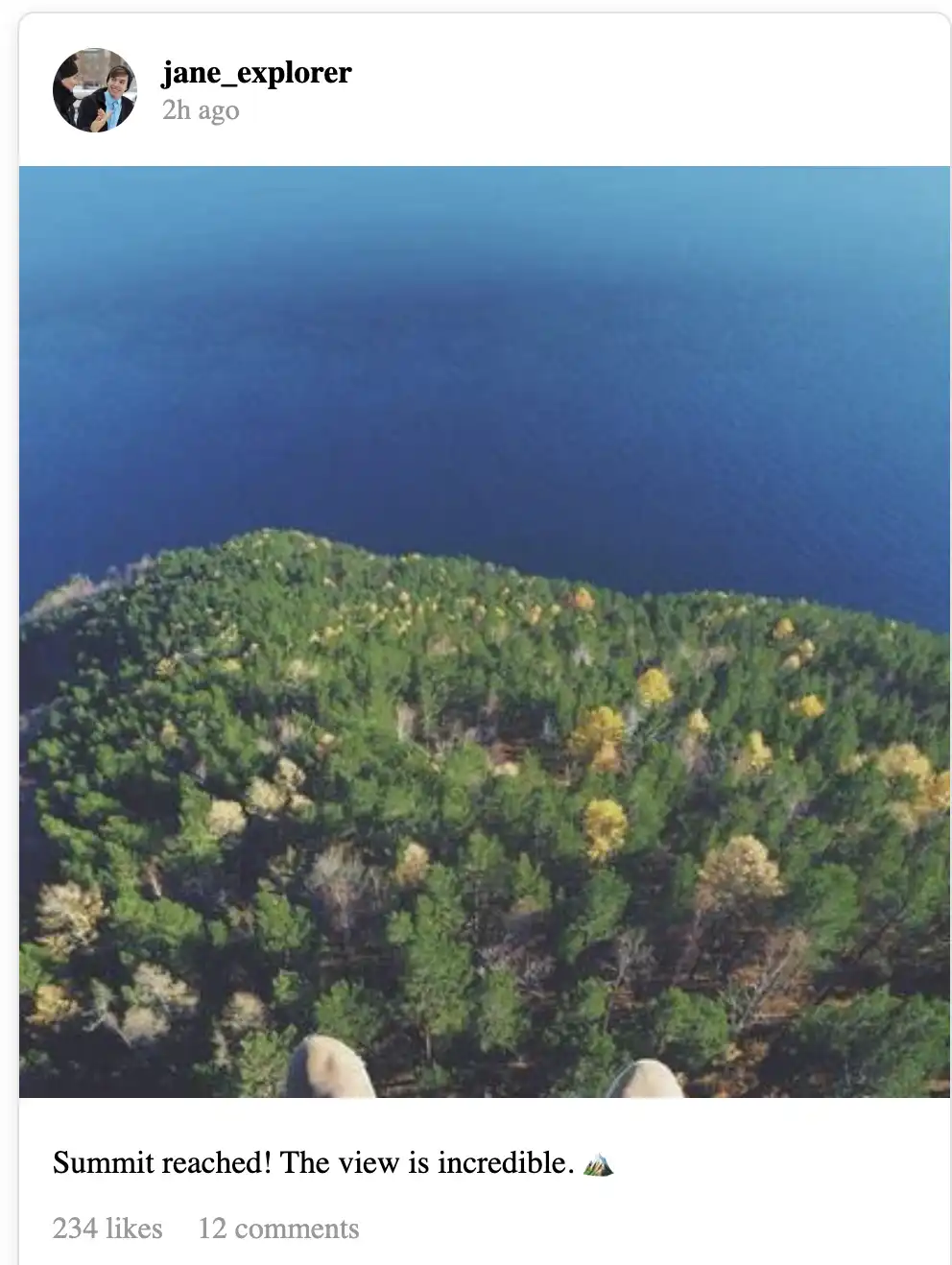
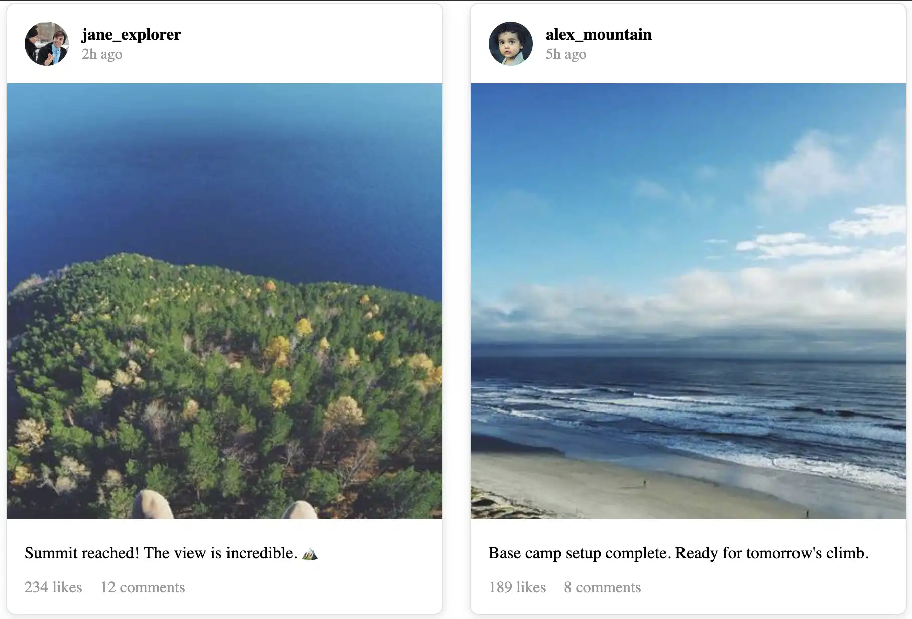
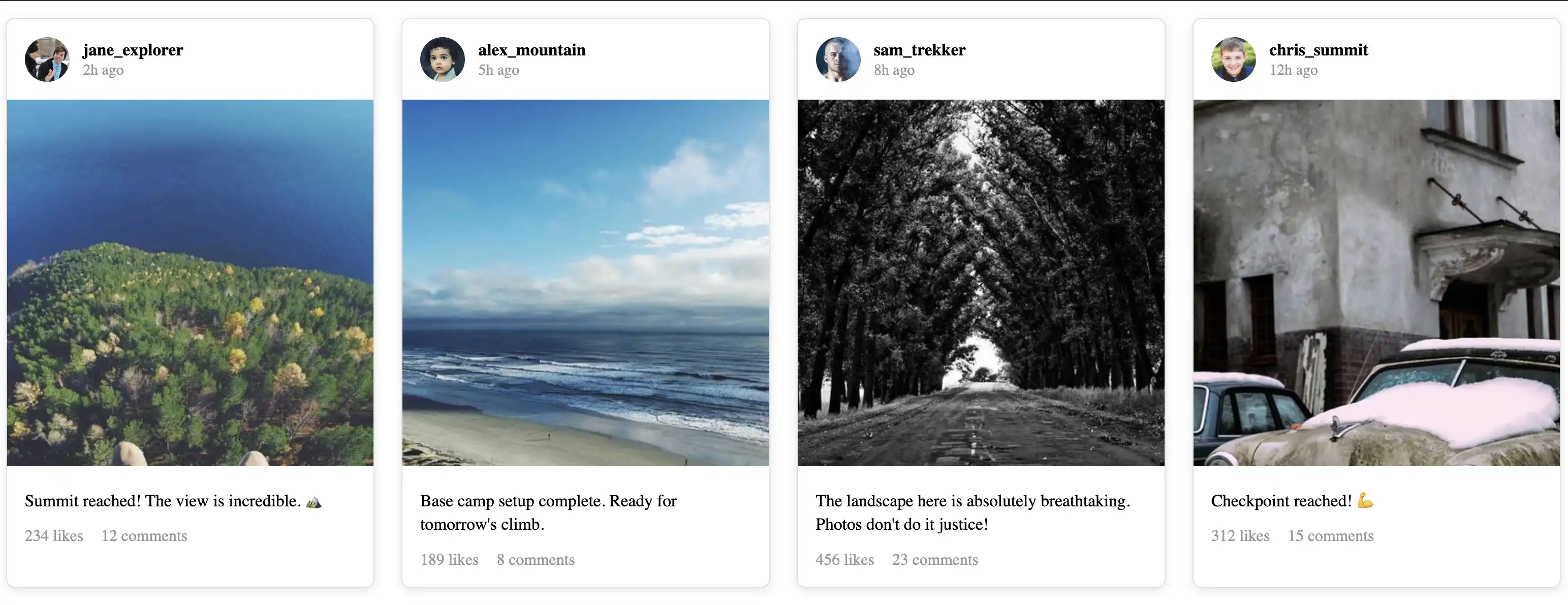
<article class="social-post">
<div class="post-header">
<img src="https://i.pravatar.cc/150?img=1" alt="Jane Explorer" class="post-avatar">
<div class="post-meta">
<strong class="post-author">jane_explorer</strong>
<time class="post-time">2h ago</time>
</div>
</div>
<div class="post-image">
<img src="https://picsum.photos/seed/social1/400/400" alt="Summit view">
</div>
<div class="post-body">
<p class="post-caption">Summit reached! The view is incredible. 🏔️</p>
<div class="post-stats">
<span>234 likes</span>
<span>12 comments</span>
</div>
</div>
</article>
<!-- Post 2 -->
<article class="social-post">
<div class="post-header">
<img src="https://i.pravatar.cc/150?img=2" alt="Alex Mountain" class="post-avatar">
<div class="post-meta">
<strong class="post-author">alex_mountain</strong>
<time class="post-time">5h ago</time>
</div>
</div>
<div class="post-image">
<img src="https://picsum.photos/seed/social2/400/400" alt="Base camp">
</div>
<div class="post-body">
<p class="post-caption">Base camp setup complete. Ready for tomorrow's climb.</p>
<div class="post-stats">
<span>189 likes</span>
<span>8 comments</span>
</div>
</div>
</article>
<!-- Post 3 -->
<article class="social-post">
<div class="post-header">
<img src="https://i.pravatar.cc/150?img=3" alt="Sam Trekker" class="post-avatar">
<div class="post-meta">
<strong class="post-author">sam_trekker</strong>
<time class="post-time">8h ago</time>
</div>
</div>
<div class="post-image">
<img src="https://picsum.photos/seed/social3/400/400" alt="Mountain landscape">
</div>
<div class="post-body">
<p class="post-caption">The landscape here is absolutely breathtaking. Photos don't do it justice!</p>
<div class="post-stats">
<span>456 likes</span>
<span>23 comments</span>
</div>
</div>
</article>
<!-- Post 4 -->
<article class="social-post">
<div class="post-header">
<img src="https://i.pravatar.cc/150?img=4" alt="Chris Summit" class="post-avatar">
<div class="post-meta">
<strong class="post-author">chris_summit</strong>
<time class="post-time">12h ago</time>
</div>
</div>
<div class="post-image">
<img src="https://picsum.photos/seed/social4/400/400" alt="Trail marker">
</div>
<div class="post-body">
<p class="post-caption">Checkpoint reached! 💪</p>
<div class="post-stats">
<span>312 likes</span>
<span>15 comments</span>
</div>
</div>
</article>
<!-- Post 5 -->
<article class="social-post">
<div class="post-header">
<img src="https://i.pravatar.cc/150?img=5" alt="Taylor Ridge" class="post-avatar">
<div class="post-meta">
<strong class="post-author">taylor_ridge</strong>
<time class="post-time">16h ago</time>
</div>
</div>
<div class="post-image">
<img src="https://picsum.photos/seed/social5/400/400" alt="Equipment check">
</div>
<div class="post-body">
<p class="post-caption">Final gear check before the big push tomorrow.</p>
<div class="post-stats">
<span>267 likes</span>
<span>19 comments</span>
</div>
</div>
</article>
<!-- Post 6 -->
<article class="social-post">
<div class="post-header">
<img src="https://i.pravatar.cc/150?img=6" alt="Jordan Peak" class="post-avatar">
<div class="post-meta">
<strong class="post-author">jordan_peak</strong>
<time class="post-time">20h ago</time>
</div>
</div>
<div class="post-image">
<img src="https://picsum.photos/seed/social6/400/400" alt="Sunrise">
</div>
<div class="post-body">
<p class="post-caption">Early morning start. Worth it for this sunrise! ☀️</p>
<div class="post-stats">
<span>523 likes</span>
<span>31 comments</span>
</div>
</div>
</article>
</div><!-- end .social-feed -->
</div><!-- end .container -->
</section><!-- end .social-updates -->
2 Next, you will make add in a css rule for the social media section.
CSS Social Media (copy to site)
.social-feed {
  /* TODO: Make this a responsive grid

  Questions to ask yourself:
  - Should this use Grid or Flexbox?
  - What technique lets columns adjust automatically? (Hint: Lesson 06)
  - What's a good minimum width? (Hint: 240-280px)
  */
}
Your task is to make the design adapt to the content. Let the content be your guide.
Here are reference images:
Tips To Help You Complete
Step 1: Section Spacing
TODO: Add the same spacing as other sections
Start with the .social-updates section container.
Think about:
Look at your .content and .field-kit sections
What property gives them vertical spacing?
Use the same pattern here
Check: The section should have breathing room above and below it.
Step 2: The Grid (Most Important)
TODO: Copy the pattern from .cards but adjust the minimum width
This is the heart of responsive design. You're creating an intrinsic grid.
Questions to ask yourself:
What display property makes a grid?
What creates columns that wrap automatically? (Hint: repeat, auto-fit)
What's a good minimum width for a social post?
Too small (200px): posts get cramped
Too big (400px): only 1 column on tablets
Just right: 240-280px
What unit lets columns grow equally? (Hint: fr)
How much gap between posts?
Step 3: Basic Card Styling
TODO: Make each post look like the update cards.
Background color?
Border?
Border-radius?
Shadow?
Overflow hidden?
Look at your .card styling for reference.
What did .card have?
Background color?
Border?
Border-radius?
Shadow?
Overflow hidden? (for rounded corners on images)
Step 4: Post Header Layout
This is where avatar and username sit side-by-side.
Think about:
Avatar on the left, text on the right
They need to be aligned vertically
This is a job for... what layout system? (Hint: not grid)
For .post-header (TODO: Layout avatar and text side-by-side)
Questions:
What display makes things sit next to each other? (Hint: flex)
How do you align items vertically? (Hint: align-items)
What padding feels comfortable?
How much gap between avatar and text?
For .post-avatar (TODO: Make the avatar circular)
Questions:
What width and height? (40-50px is typical)
How do you make a square into a circle? (Hint: border-radius)
Should it shrink if space is tight? (Hint: flex-shrink: 0)
for .post-meta (TODO: Stack username and timestamp)
Considerations:
This might just work naturally, or you might need flex-direction: column
for .post-time (Make this look like secondary text)
What color did you use for muted text elsewhere? (Hint: check your variables) Should it be smaller?
👉 Check: Avatar should be a circle next to the username.
Step 5: Post Images
TODO: Make images square and prevent distortion
You did this EXACT same thing with card thumbnails!
You need TWO properties:
aspect-ratio: ??? (Hint: what ratio is a square?)
object-fit: ??? (Hint: cover or contain?)
Also, should images fill their container width?
Check: All images should be perfect squares that don't look stretched.
Step 6: Post Body
Style the caption and stats.
For .post-body (TODO: Add padding and spacing)
Should this also use flex-direction: column with gap?
What padding matches the header?
For .post-caption (TODO: Style the text)
Remove default paragraph margins?
What font size is readable?
What line-height feels comfortable?
For .post-stats (TODO: Layout likes and comments side-by-side)
Flexbox with gap? Or just let them sit inline?
Should these look like metadata (smaller, gray)?
Step 7: Test Everything
Locked Message